Exploring the key elements of effective Design Systems
Effective Design Systems have a number of key elements that ensure quality, usability, and fulfill their purpose: to help teams speed up work and maintain consistency in their products and working methodologies.
In our previous article in this Design Systems series, we discussed their numerous benefits. In this piece, we’ll delve into the essential components of a Design System that, at an operational level, enable us to achieve coherence and efficiency in design:
- Style guide
- Design principles
- Component library
- Detailed documentation
Style guide: the core of the Design System
A style guide, also known as a visual identity guide, is a set of rules and guidelines that establish how the visual elements of a brand, product or project should be presented.
Within Design Systems, its function is to provide a unified and consistent reference for all visual aspects of our organization’s brand or product identity.
Key elements of a style guide include:
- Logo and visual identity: permitted logo versions on different backgrounds and sizes; minimum spacing around the logo; incorrect uses to avoid; and possible variations or alternate versions.
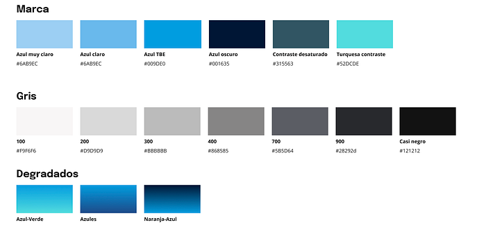
- Color palette: primary and secondary brand colors; achromatic palette (grayscale) and system messaging palette; color codes in hexadecimal or RGB; appropriate uses for each color and recommended combinations; and examples of colors for backgrounds and texts in various contexts.
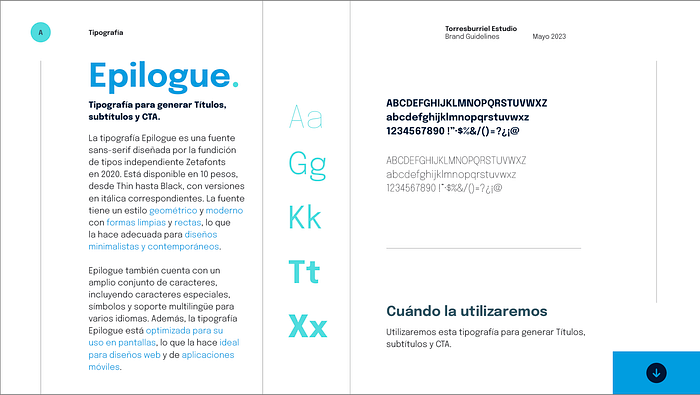
- Typography: chosen brand typefaces; specific uses for each font (titles, text bodies, headers); recommended font sizes and spacing; and examples of applying typography in different materials.
- Graphic elements: icons or illustrations used in the brand; styles and variations of the icons; recommended sizes and proportions; and uses and restrictions of these elements.
- Images and photography: visual style and tone of images to be used; guidelines for choosing images to maintain consistency; and access to image banks (if any).
- Spacing: pixel base (if established); definition of spaces and margins recommended for different elements; and how to use white space to enhance readability and clarity.


Design Systems principles
When we design, we always do it with a specific purpose in mind. And how do we ensure that the purpose of our product is reflected in the design? Thanks to the principles of our System.
The principles in Design Systems are a set of concepts that guide decision-making and the creation of system elements. These principles act as general rules that help designers and teams maintain coherence, effectiveness, and purpose behind every aspect of the design. The principles are essential for establishing a solid and consistent foundation in the creation and application of elements in a Design System.
There are different types of principles. Depending on the organization, we can find that they are focused in one way or another:
- Brand focus: animated, vibrant, honest, elegant, etc.
- Work methodology focus: iterative, fast, reflective, reusable, flexible, etc.
- Cultural focus: inclusive, accessible, unified, consistent, innovative, etc.
These principles act as an ethical and aesthetic guide in the design process, helping teams make coherent and effective decisions while creating elements within a Design System. Each Design System may have specific principles that adapt to its context and goals, but in general, these principles work together to ensure coherence and quality of design in all applications. And they have characteristics that we must keep in mind:
- They must be authentic: some terms like friendly, simple, and others are frequently used, the question is to adapt them to our needs and add value. Certain of these principles should be assumed because they are inherent to any good design project, although sometimes it does not hurt to highlight them.
- They must be practical: it is not the same to say that something is simple as it is to explain why it is and how to achieve that simplicity.
- They have a clear perspective: they should make clear the priorities when working.
- They are easily remembered: if not, we must continue working on them.
Component library: building reusable blocks
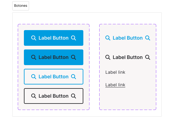
Component libraries are a collection of predefined and reusable design elements, used to create coherent and attractive user interfaces. Common elements included in these libraries typically are, for example:
- Buttons
- Cards
- Form fields
- Navigation menus
Another important aspect to understand about component libraries is that they can take various forms. They can be code libraries in a repository, design libraries in a tool like Figma, Adobe XD, or Sketch (the famous UI Kit), or they can be both simultaneously.

In organizations that do not have a dedicated space exclusively for designing custom components or do not have their own established Design System, existing component libraries such as Google’s Material Design are often used.
In younger Design Systems, there may only be a UI Kit for design, and as designs are implemented, components are created at the development level in a repository.
In organizations with more mature Systems, both types of libraries exist and coexist, and an effort must be made by Design System teams to ensure that changes and modifications made to the components are reflected in both.
Regardless of the situation, your component library should always contain all the significant and reusable interface building elements for your product or products. If your product is an e-commerce platform, you’ll likely have product card components, for example. And if your product is for event management, you will almost certainly have calendar and agenda components.
Detailed documentation
Documenting in detail all the elements that make up the Design System is a crucial task to ensure teams have a clear reference and a resource to turn to in case of doubt. It’s necessary to document processes, style guides, principles, components, and everything that forms part of our ecosystem.
Documenting might seem tedious to some, but there are plenty of reasons to do it:
- Documentation establishes clear rules and guidelines. This ensures that all team members follow the same standards.
- Whenever a question arises about how to use a specific element or how certain styles are applied, the documentation acts as a reliable reference to resolve doubts.
- Clear and detailed documentation reduces the likelihood of making errors in implementation.
- As the System grows, documentation becomes essential to maintain coherence and facilitate its expansion.
- Additionally, new team members can access the documentation to quickly understand the design standards and principles.
Our advice: as you create parts of the Design System (a component, a color palette, a usage example, etc.), invest time in documenting them well.
Conclusion
In summary, exploring the key elements of an effective Design System shows us how to establish a solid foundation for achieving coherence and efficiency in design. An effective Design System includes:
- Style guide: Rules and guidelines for uniformly presenting visual elements, building a solid and recognizable identity that represents the brand or organization.
- Design System principles: Guide decision-making and element creation, establishing an ethical and aesthetic basis for design.
- Component library: Offers predefined and reusable elements for constructing coherent and attractive interfaces, both at the design and development levels.
- Detailed documentation: An essential reference for teams, establishing rules, resolving queries, and reducing errors.
Together, these elements form an ecosystem that promotes visual coherence, design efficiency, and the sustainable expansion of the Design System.
We recommend exploring the possibility of creating a Design System for your projects, so get started on building an effective Design System!
In the next article of this series, we’ll discuss how to implement a successful Design System and talk about other success stories in the tech sector.
This is a translation of the following article from our corporate website:
